A preview of our new site for Earth Day!
April 22, 2011 9:34 AM   RSS feed for this thread Subscribe

We've been working behind the scenes for the past couple months on a revamp of the entire site, and would like to show that off to existing members today.

This is very much a work-in-progress and we've got a lot of improvements coming down the road, but I wanted to show off the new design and a few new features before I describe what else is coming.

The beta site is at http://new.fuelly.com/.

Here's my car page as an example

New Fuelly car pages

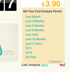
Aside from a new look, the car pages are a bit different, offering a new look, increased data in the graphs, and a way to filter your Cost Analysis section (click the little "2011" to get more options). When you filter the cost analysis, the setting "sticks" and is carried over to any other car you look at on the site, not just your own (so you can make comparisons)

Fuelly cost analysis filter

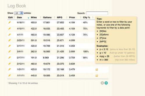
We'll be adding more stats (and custom options for whatever you want to track) but for now you can see expanded graphs and you really should check our the fuel log, which has some pretty fantastic search options.

Fuel log filtering

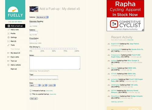
The new Fuel up page offers the feature of telling us your City vs. Highway driving amounts, and yes, you can go back and edit your older fuel ups to include this information for an accurate reading on your car page (we are defaulting everyone to 50/50% for now, but will replace it with a "no data" static graphic by the time we launch the new design).

New fuel up page

If you want to check out how the new design looks on other cars, hit the Recent Activity page and click on random users and cars to see their data.

The rest of the working pages on the site are just copies of the existing pages and features, but we will be slowly rolling out new versions of pretty much the entire site by the end of May. We've also just set unfinished pages as dead links for now, so not all parts of the site are going to work (you'll see the 404 page a lot if you click around).

Keep in mind this is the tip of the iceberg and we'll be debuting a lot of requested features in the next few weeks but I wanted to give a preview of what is to come.
posted by mathowie to Fuelly Site Issues at 9:34 AM (200 comments total)

BDC
Apr 22, 2011
11:28 AM

Like Borat says, "Very nice!" These are changes that we've all been waiting for.

Couple of questions:
1) Will the "recent fuel ups" line graph show more than 10 fuel-ups (for example, as many entries as we opt to show in our log book)?

2) Will the bar graph for average mileage by month have a constant zero for the y-min value (like it always has), or will it be scaled to the minimum mileage point like the new site does? The scaling makes the graph deceptive (for example, for our Scion, from sept. to oct. 2010, it makes a 3mpg/10% drop in mileage look like a 50% drop-off).

3) This might be going out of the scope of the changes, but would there be a way to make the "cost analysis" time period show more than just cost statistics? For example, if I wanted to find out how many miles I had driven or what my MPG was in the past 3 months in addition to how much I had spent.

4) Thanks for spending your time making the site work better!


mathowie
Apr 22, 2011
12:51 PM

Hey BDC, we are testing this new layout and feature set, and one of the things that has come up is that maybe the cost analysis filter could instead be a filter for all data shown on the page. So it defaults to just this year, or the last x months, but if you changed it to say, 2009 or All Time, not just your cost analysis would change, but the graphs, the # of fuel ups and miles, and log entries below.

If we did that, that'd solve pretty much all your questions, correct?


BDC
Apr 22, 2011
1:55 PM

Pretty much, except for the vertical scaling on the monthly averages. It is much more useful when the lower limit is zero and only the upper limit is scaled.

bates
Apr 22, 2011
3:52 PM

The new site looks fabulous, thank you Fuelly for all that you do, I truly appreciate it. I love the current site, but it looks like I might be in for a very pleasant upgrade when the new site is ready.

Will all of our old data from the original site be automatically uploaded to the new site or will I need to reenter my historical data?

andrewgd
Apr 22, 2011
3:59 PM

The input page on the mobile version expanded vertically a few months ago, requiring more scrolling. Seems like it could be compressed back down so I can see more input boxes at once.


pb
Apr 22, 2011
4:01 PM

You won't need to do anything on your end bates. All of your data will be the same when we launch the new design—you'll just have some new ways to look at it.


pb
Apr 22, 2011
4:07 PM

Sorry you don't like the recent changes to Fuelly Mobile, andrewgd. The fields are a bit farther apart to make them bigger targets for people's fingers on smaller screens. If you have big fingers you might appreciate the change, but if you don't it might seem like a waste of space. Thanks for the feedback.


DTMAce
Apr 22, 2011
5:32 PM

One thing that stands out immediately to me is the page sizing. My netbook will not show it correctly, due to its screen size I'm guessing... (1024x600)

Current site, no problem, new site, sticks off the edge now. lol

Outside of that, looks really good guys, nice work!

udtrev
Apr 23, 2011
2:45 AM

I found an issue, I adjusted the highway / city ratio and found afterwards that the cost per litre and amount used bore no relationship to their previous values, there was an obvious impact on my stats (I've set them back)

udtrev
Apr 23, 2011
2:56 AM

When will the 'badges linked' be up and running ?


pb
Apr 23, 2011
8:41 AM

Can you describe that problem at bit more udtrev? When you say "bore no relationship" what do you mean exactly? The values were wrong?

We don't have a timeline for specific pieces. new.fuelly.com is just a preview right now. We'd like to have the new site completely working at www.fuelly.com by the end of May.

udtrev
Apr 23, 2011
11:41 AM

I've just added a 75% mix to the entry for Bella dated 18/3, you can see the issue - it appears to be when it saves.


mathowie
Apr 23, 2011
3:49 PM

udtrev, it's probably a metric/english conversion error on our part, we'll look into it.

udtrev
Apr 23, 2011
4:40 PM

The total litres should be 27.48, hope that helps you nail it down.

Trev

Giterdone
Apr 24, 2011
8:58 AM

Very nice layout guys. Looking forward to it.


srellim234
Apr 24, 2011
12:28 PM

Very nice look. For those of us who are getting older and don't have the eyesight we used to, though, would it be possible to use the same darker shade of blue that you currently use? The contrast between the lighter blue and the white background on the beta page is a little tougher to read than the current version.

udtrev
Apr 26, 2011
12:36 PM

Guys,

Can you let me know when you are finished with my example data entry please ?

I would like to get my entry showing correctly :-)

Trev

vr4Legacy
Apr 26, 2011
2:53 PM

Looks great so far.

I LOVE the search feature. Thanks!!

I also noticed it is a little wide on my monitor at work. Unfortunately we use I.E. 5 and I am guessing that is why... but the current site fits right.

Not sure if that would be an issue enough people would have to address, or just something us with old browsers are stuck with.

Unfortunately I can't upgrade at work.....


pb
Apr 26, 2011
3:48 PM

Go ahead and update, udtrev. Thanks for helping us out with that.

udtrev
Apr 26, 2011
11:17 PM

Cheers Paul,

If I remember I will do a fill up on the new system later


Trev

udtrev
Apr 28, 2011
6:28 AM

Just added fill up with the new system, it has the same bug :-( I know my car won't take 48 gallons !


pb
Apr 28, 2011
8:11 PM

Sorry about that udtrev. Just consider the new design a preview for now. We'll get the bugs ironed out before we launch it here.

udtrev
Apr 29, 2011
1:01 AM

No problem Paul, Errorik has been grafting away in the background, it now saves fine :-)

udtrev
Apr 29, 2011
1:06 AM

I'm happy to help by reporting issues as they arrive like the one in the logbook - although the system has correctly saved the fillups, the logbook is showing them in US not Imperial gallons, with the price per gallon having the same issue - we Brits would LOVE to be paying that a gallon !!

udtrev
Apr 29, 2011
1:42 AM

I've sent Errorik the first list of issues.
Trev

ghammerly
May 9, 2011
11:10 AM

Looks fantastic. I love the features and the look.
Would like to be able to sort vehicles to look at statistical data by year; type of fuel used ex: diesel, gasoline, cng, lpg, etc.; number of cylinders or rotors; displacement ex: 1.4L, 1.5L, 1.6L; transmission type ex: 5spd. manual, 5spd. automatic, CVT
I know it makes it more complicated and longer to enter all the information but many cars have many different drive-train options or have been modified with engine swaps, dual fuel set ups, etc.

Nitsud
May 9, 2011
12:20 PM

I checked out the new layout and thought it was pretty nice. Although I found it a bit big to view on my netbook, I think it's something I would get adjusted to. It's definitely an improvement in terms of aesthetics.

Some things I noticed and some suggestions I have:

Firstly, I noticed that the notes are no longer displayed but instead have something you highlight with your cursor to view. In the past, the note would be displayed in text same as the fuel up data. I would like very much if this could be left the same.

Secondly, how about a theoretical maximum distance based on the average fuel economy + the fuel tank size of the vehicle. This could be something the user could add manually and displayed if said fields are filled.

Thirdly, and this is just a personal thing; I would like if there was a km/L display in the metric field. While MPG is also nice to have, I am having a hard time accepting this L/100km designation.

Of course, that's just a personal thing.

Thanks very much for the change!

Sjetware
May 9, 2011
12:44 PM

I like the new layout; however it seems the image for your car is being incorrectly sized or squished on the car listing screen.


BDC
May 9, 2011
1:13 PM

Personally, I think the new note display is a big improvement. The old way, they were never formatted correctly and took up big chunks of space. This way the log looks nice and neat. I'd rather just roll over and read the notes that I want to read anyways.

schmiedel
May 9, 2011
3:36 PM

The new design makes a more fresh/cool look, this is very nice. However, I'm seeing that it behaves very similar to the actual site. It would have been cool to use more advanced web development techniques with ajax services, this could reduce traffic and make the interface more user friendly (less clicks).

MMUK
May 9, 2011
3:52 PM

I can't find the link to look at the same make/model vehicles... I like to compare the other Audi A2s. Maybe I'm just looking in the wrong place.

Also, I put a lot of effort into the 'notes' section, and it's unfortunate that this only shows up in a tooltip style display now.


jprestonian
May 9, 2011
4:08 PM

Like!
.

ResmeN
May 9, 2011
5:20 PM

The new design looks nice however I can't use the Add a fuel up link on the left of my dashboard anymore and will only accept my fuelups if I click on the actual vehicle then press the red Add a fuel up link.

yourmom
May 9, 2011
5:40 PM

the notes section is just as important to me as the MPG. I know am not a typically fuelly user but... I wish the note section had more importance here. or a better way to view them all at once. say i want to see when i changed my oil last i now have to hover over each note until i find it. i know there are tags but they are pointless to me if your going to give us a note section we should be able to view it just as easily as MPG.

maybe just a "view notes" page. what about the export feature?

so far not impressed, sorry. I love fuelly, please don't make me find something else.

Paw
May 9, 2011
6:56 PM

looks good, but where is the browse Vehicle section--i love that its the real world numbers!

phil

Delboy
May 9, 2011
7:32 PM

I like the new data and City - Highway stat. Need the browse vehicle section. I thought you would make use of the widescreen format instead of having to scroll further down the page, the graphs could hold more info if widescreen was better utilized.
Looks nice and easy to read.

Delboy


E1
May 9, 2011
7:33 PM

Different is better. I like the added features on the new site. Thumbs up.

TVdoorknob
May 9, 2011
7:34 PM

Down at the bottom of the car page (where you see recent fill-ups) I would love to see at least some of the note field content ... even if only the first 32 characters or so can be shown and you have to hover your mouse cursor to see it all pop in box. Otherwise, looks nice.

It OK, not grate - I don't like adds.

tmant13
May 9, 2011
7:45 PM

LOOKS GREAT! 4 thumbs up :P haha

mikewithaprius
May 9, 2011
7:52 PM

Notes I don't mind because of the search feature.

One thing - where did the EPA numbers go? I think the whole idea of tracking numbers is to give people an idea of where they are, and the EPA numbers, however flawed the test is, are a constant reminder of possibilities. If they're hidden somewhere, they really should be on the main page for each car.

The whole thing looks great!

mikewithaprius
May 9, 2011
7:54 PM

Just noticed a bug - my best fillup date is incorrect on the new page. It's off by a couple months.

mikewithaprius
May 9, 2011
8:03 PM

Ooh boy, I'm hogging the posting space :-) I keep looking back at it and posting something else. Apologies, should have looked more carefully at first.

I noticed another feature has disappeared - the very powerful "how much would I save if I got 1, 2, 3 mpg more" chart. I found that absolutely brilliant, and a great way to show people with their dollars how they could save money by driving better. It would be a shame if all the features encouraging good driving and saving money and gas (the EPA numbers, this chart) went away.

It still looks great, but those things take away a lot for me.

Also, my number of fill-ups is incorrect. Should be 17, says 13 (guessing something to do with partial fillups?).

jawnguy
May 9, 2011
8:16 PM

In the logbook, will we be able to change the units from Miles, Gallons and MPG to Kilometres, Litres and L/100km? I've set the units to metric but it doesn't seem to make this particular change.


pb
May 9, 2011
8:55 PM

Thanks for all the responses, ideas, and bug reports so far—we're listening.

Paw, the Browse Vehicles section is listed if you click "Tools" in the menu on the left.

Yep jawnguy, we'll get unit conversion working soon.

jawnguy
May 9, 2011
9:29 PM

Great! Also, will there be the inclusion of the Annual Reports? The Cost Analysis feature is pretty neat but I'd like to know the total kms driven that year as well


DTMAce
May 9, 2011
10:09 PM

Not sure if its the advertising tie-in or what, but the page loads HORRIBLE slow now, compared to how the current site loads.

While I type this, I am still waiting for the dashboard to come up. Bear in mind that YES I still have a dial up connection, sorry but not all parts of the world can get high speed, however even with high speed that I can borrow elsewhere, I can see a loading difference. Seems to tie up mostly loading something from google.

For me, google is like wal-mart. Bloated and hogging everything. I know that a high traffic site always wants to have some sort of ads, to generate revenue to pay for itself, but just to be off topic, I NEVER click or pay attention to ads anyway, so from my perspective they are a waste. LOL

Sad to see that you have to add that in, I think that is why my netbook doesn't fit now, the ad is pushing the page too wide.

Maybe a top or bottom horizontal ad instead?

As for some of the posters, I would assume that not all data is going to track over correctly just yet, or like in my case, some of your data entry could cause things to be off. I had to correct one of my note entries, I don't think it liked having extra !!!! points. Even made my import into Excel work weird.

As for the 1,2,3 and EPA thing being removed? EXCELLENT. I hated that thing. It goes by your averages anyway, not your last purchase price if I recall, and to be quite honest with the way most people's fill ups vary, you could go up or down 10 MPG sometimes, so that blows that thing out of the water pretty much.

I do like the idea of having a multitude of 30 averages, like the way we had price per gallon, but also for MPG, mileage driven, things like that.

I know its a work in progress, just going to have to make a point to post new updates for us to check out, or something.

Keep it up!


DTMAce
May 9, 2011
10:11 PM

Multitude of 30 DAY averages, my mistake. Arrrg!


errorik
May 9, 2011
10:14 PM

@jawnguy - There is a link below the City Vs Highway chart that says "Want to display some custom stats here?" - if you click on that you can add a stat for "Total Distance Tracked" and then the time period you are interested in... you can have whole years or a rolling period like last 3 months. The interface on how to add custom stats will be changing before launch, but the functionality is there.

@mikewithaprius - those features (how much would you save, EPA, similar cars) are not going away... you will see them return shortly...

@yourmom - there will be a dedicated log book page that will have all the notes expanded

czechsmasher
May 9, 2011
11:18 PM

cant follow the gallons / price or mpg now.
can we have litres to the miles rather than km for the uk market
thx


errorik
May 9, 2011
11:22 PM

@czechsmasher - is your Units set to UK? under the fuelly logo?

MUD4FUN
May 9, 2011
11:57 PM

I've had a quick look around the new site and overall it looks great.

I found a few small issues such as mpg on history seeming to be in US gallons even though I was set for UK but I'm sure these bugs will be ironed out pretty quick. The main issue I have is the notes. I prefer the current format with notes visible next to each fuel up rather than the new mouse over. I use the notes alot now to record subtle variances in my journeys/drivers/fuel etc and it will be a pain to hover over each one in turn when reviewing recent fuel ups.

I couldn't see the links for import/export of data, I assume they are still going to be there as I will need to export my 400 fuel ups to add the highway % and then re-import as that will be alot quicker than manually editing that volume.

Overall though good work - very fresh looking site.


jacrabbit
May 10, 2011
12:52 AM

Sweet, Thumps up Guys!


Birdy68
May 10, 2011
2:13 AM

Without look over the current feedbacks/requests, I'd like to ask that I can see my 'retired' cars/bikes at a first glance and not have to dig into a menu to look them up.

Also - please try to develop an App (Android) for fuel-ups.

Thanks a million in advance.

yourmom
May 10, 2011
5:08 AM

@errorik - Sweet, Thank you!

jkp1187
May 10, 2011
7:01 AM

It isn't just about cost, it's also about total fuel used. Why not include fields that show total fuel used for the past 12 months, and total fuel used since logging began?

Also, while I like the new dashboard, but I don't like the logo. Think the old logo looked better.

Thanks!

JKP


CanadaPanda
May 10, 2011
8:34 AM

I'd really like the notes to be expanded again instead of having to mouse over them.

I really like the city % feature, and I've already edited any past fillups I can remember the percentage for.

One thing though. The site seems to load more slowly than the previous version. It seems too loaded down with info on a single page.


fr0gstrangler
May 10, 2011
9:38 AM

Id like to see the recent fuel up graph back!

Birdie
May 10, 2011
9:46 AM

I would like to see the notes back in view rather than having to point over it as I can currently see at a glance what kind of driving conditions (weather, cruise control etc. ) are factors in what mileage I gotten. Also I find the text and graph colors not dynamic and not enough contrast for easier reading. Feels 'wimpy" and harder to read and take in the information.

I too would also like to see the recent fuel back up.

Otherwise I like the new features. Thanks so much!


pb
May 10, 2011
10:17 AM

Id like to see the recent fuel up graph back!

It's still there. Where are you expecting to see it that you aren't?

Dogfish
May 10, 2011
12:33 PM

The new layout is fine and I like some of the features you're adding, but what happened to the "information" column to the left that allows you to browse vehicles and the site in general? It functions for me as a convenient mini-site map where I can access the basic parts of the website. It seems to be there when I'm not logged in but then disappears once I do. Everything else seems to be good, though.


pb
May 10, 2011
12:49 PM

Dogfish, if you click Tools on the menu you'll get those items. But yeah, that's a good point, we're going to make those permanently expanded before we launch here.

dawooda3
May 10, 2011
3:03 PM

i would like to see something that shows the national average for diesel prices and things like that.

00CrewCab
May 10, 2011
3:28 PM

Nice!

kevm14
May 10, 2011
4:29 PM

I am liking the custom stats. But I miss the old notes display method. I like to be able to read through all my notes quickly. Having to mouse-over is kind of a bummer.

kevm14
May 10, 2011
6:03 PM

I would also argue for more custom stats like gallons per 100 miles, which is a better way to compare efficiency than mpg. I don't use liters or km, though, so L/100km isn't intuitive at all.


Franny
May 10, 2011
6:13 PM

It looks pretty cool. May take a little to get used to, but it should be good.


mathowie
May 10, 2011
6:20 PM

kevm14, we'll continue to add new custom stats as we develop the site further, so gallons/100 miles or even gallons/10,000 miles will be options.

JDub
May 10, 2011
9:22 PM

I like new features but I don't think the new layout is an improvement. I like that the website starts at the left. Centered sites are weird. Also the old color scheme works better.

mikewithaprius
May 10, 2011
10:38 PM

Thank you all staff and programmers for the responses, also very cool how quickly you're working on it, all the stuff I mentioned magically appeared on the page when I took a look tonight!

lovemysantafe
May 11, 2011
3:05 AM

AWESOME!!! Love the new look! :-)

pensfan30157
May 11, 2011
5:24 AM

Page formatting is off a little on my browser page also....does not quite fit all info in the window pane. No biggie, just a little thing thats off some. Looking good so far.


chieftmc
May 11, 2011
5:40 AM

I like the new look and the added info. Thanks for updating the site and adding "nice to know" info :-)


dtjohnso
May 11, 2011
8:04 AM

One feature that I'd like to see: could the add a fuelup form automatically strip out currency characters like the $ ? I always have to remember to remove that myself, but it seems like it would be easy enough to only accept digits, dots, and commas as input for that field so I can throw whatever into it.

BrianB
May 11, 2011
10:45 AM

Looks good folks. My only question would be, "is there any way the log book can have a switch to show either miles and gallons OR kilometers and liters?" It's taken us folks north of the 49th parallel a little while to think in liters/100 km and now mileage here is being reported in miles per gallon, a bit of a regression for us.

Otherwise, the site looks great and has lots of interesting features.


pb
May 11, 2011
10:48 AM

Yep BrianB, we'll have alternate units working in the log book before we launch.


Grump
May 11, 2011
11:02 AM

new.fuelly.com/activity/friends is broken

Scutrbrau
May 11, 2011
11:13 AM

Added content is good. The look is not. The colors suck and it looks cartoony. Why is it that every time things get added to a website the designers feel the need to mess with the whole thing?


Grump
May 11, 2011
11:17 AM

http://new.fuelly.com/car/dodge/charger/2007

All cars are reporting 11.4L/100km to me.

Kevinrudolph
May 11, 2011
12:51 PM

I love the new layout! It's very easy to read at a glance, and easier to quickly access each car's records.


madjak30
May 11, 2011
12:56 PM

I like the larger font, makes the stats jump out at you...

But the Log Book should show in the selected measurement system...in metric it is still showing US stats...miles, gallons, MPG, etc...and on the profile page all vehicles seem to be showing the same consumption as the first vehicle listed.

Looks good, and the new info is great...I like the notes being minimized...keeps the page neat...

Later.

catching45
May 11, 2011
12:58 PM

Looks good but please keep the two graph the current site uses. Thanks.

bdunn
May 11, 2011
1:43 PM

The new layout is nice, some good adds. The only downside I've seen is that the notes section is less useful. It would be much better to have the old way back.

it would also be good to have a custom stat of worst MPG as well.

bdunn
May 11, 2011
1:53 PM

The other thing I noticed is that when you're looking at a garage, the pictures look funny. Thats because the picture is supposed to be taller than it is long, but generally cars are longer than they are tall (apart from some oddball Japanese cars like the Daihatsu move) so the pictures appear tiny and you just have black space when you look at the cars. It would be better if the default space was say 3x longer than it is tall as that's more proportionate to how cars actually are.

New site really looks good. Not a very long time member, so that is probably good for me, since I usually HATE change (weather underground) But yeah....I like what I see.


Pancake
May 11, 2011
4:20 PM

Really like the updates but on my car info. page I'm not getting any of the graphs, the monthly graph nor the recent fuel-ups graph.


pb
May 11, 2011
4:24 PM

Pancake, you don't see either of the graphs on this page?

Finchee
May 11, 2011
5:04 PM

Layout looks nice and I love the new stats presentation. I would want the colors to be a bit brighter though (maybe enable users to select their own color choices?). It looks a bit bland to me when taken in against the background color. Overall, it's pretty neat.


Pancake
May 11, 2011
5:21 PM

pb, no, there are two horizontal white spaces where the graphs probably should show up.

dewy
May 11, 2011
5:30 PM

Also having trouble with the log book showing US (Read: Dead measurement systems) stats being shown rather than the metric system. Very confusing, I have no idea what the hell a mile is.

Otherwise it looks like a very nice update guys, keep it up!


pb
May 11, 2011
6:27 PM

What browser/OS are you using, Pancake?


triplefan
May 11, 2011
10:25 PM

Overall a fresh clean look, but although the teal is a pretty colour I don't find it as easy to read as something darker.

Katabolism
May 11, 2011
11:49 PM

New site looks great

Please make sure that in the fule ups section, it shows something other then miles and gallons.

I use the Metric settings, as im in Australia, and I would like to see everything in Litres and l/100kms

MMUK
May 12, 2011
3:45 AM

Since some people like the notes expanded (me & a few others in this thread), and some people like them shrunk, how about a way to flip between expanded & shrunk? (i.e. an 'expand/shrink notes' link to an alternate view or something like that).

But I prefer the handling of CR/LF characters in the new system, i.e., the old system just jammed all the text up in a big blob. So ideally the 'expanded view' would use the user's formatting like the new tooltip thing does.


errorik
May 12, 2011
4:32 AM

@everyone - the full fuel log page is active now ("View All Fuel-ups")... on that page you get 30 entries per page and the notes fully expanded. Does this satisfy the requirement for full notes?

nhbubba
May 12, 2011
5:26 AM

The new scale on the by month bar-graph is great. The old 0-xMPG scale caused the bars to all look really similar. Good call there.

The adjustable cost analysts period is also a really welcomed change.

The info-graphics in the Basic Stats area area are a little much though. I personally don't need average/last/best MPG in such huge print. And the total fillups infographic (with the gas pump) is neat, but a real space waster. The old matrix was just as effective and more conservative with the space usage.

I look forward to being able to customize this space with new and different metrics. Although I have no specific ideas for what I want to see here.

One thing that would be cool to develop is an easy way to put together a report based on all fuelups with a given keyword or keywords. I put fuel station/brand and octane into the keyword field on each fillup and would be interested to see if that effects mileage. Although the brand/octane I fillup with effects the _next_ fillup's mileage, not this fillup. If fuelly could figure that out for me, that'd be really useful.

That said, octane really should be a separate field when entering fillup data.

Overall this site is great! I like it enough to type out these comments..

golfernandes
May 12, 2011
5:40 AM

hi!

the new look and options are awesome!!
I have a suggestion:
In Brazil we usually reffer to fuel consumption in a km/L basis, meaning how many kilometers were made with 1 Liter...
i know it's easy for example to change the 2,8L/km to 35 km/L..but i didn't see this feature, and as long as you are updating, that's what I ask:

as well as I can change to US/UK/Metric, is it possible to add something like: L/km or Km/L?

thanks!

jrlnc
May 12, 2011
5:53 AM

Hi There!

The new color scheme and layout is fresh & attractive! I'm a web developer myself and I appreciate what you've done.

One great use for this site is the views of data for different models/years of a particular vehicle. Please don't remove the mpg distribution graphs for models/years!

In fact, I was hoping you would add additional filters (like include only vehicles that have x number of fuelups or more, etc.) and I wish you would calculate & display weighted mileage for an entire group (model/year). I'd also like to see ranking within model for each individual's mpg figure.

Keep up the good work!

zsadik
May 12, 2011
6:27 AM

Excellent. Love the new site!!


JohnPT
May 12, 2011
6:36 AM

The City vrs Highway is really cool. Will the last percentage be carried over to new fuel ups? Or can you set the default percentage in the vehicle profile?


Pancake
May 12, 2011
9:15 AM

pb, on my work computer I'm not seeing the graps either-Internet Explorer 8, Windows XP. @ home (where I first noticed the issue)I'm using Internet explorer 8 and Windows Vista.


Pancake
May 12, 2011
9:21 AM

pb, they do show up on my droid.


pb
May 12, 2011
9:49 AM

Yep, I can verify that the graphs aren't working in IE. Thanks for the extra info. It's on our bug list!

Rabidsnipe
May 12, 2011
9:52 AM

I prefer the old logo. It makes it look like you're about cars, fuel, and money. Showing the tachometer or speedometer makes me think about performance.


pb
May 12, 2011
10:48 AM

ok, graphs should be working in IE now.


allancawood
May 12, 2011
12:52 PM

I like the new website look. it looks awesome.

1) why does the grid of fuel ups not take into account the metric settings that I have selected?

2) Mobile site on blackberry: I cannot add a fuel up as the litres fields doesnt allow me to put in a "." - it says it has to be a numeric value.

All in all a great site and loving the info it is giving me.

Thanks,
Keep it up.

jigger
May 12, 2011
1:10 PM

There needs to be a way to save unit preference. I have to swtich to metric every time I log in.


pb
May 12, 2011
1:15 PM

jigger, go here and set the first preference, "Display Units". That should save your preference.


pb
May 12, 2011
1:17 PM

allancawood, which Blackberry model do you have? And are you using the default browser or Opera?


primaltone
May 12, 2011
6:24 PM

As others have said, I love this site. It makes research and analysis incredibly easy.

One thing I've noticed when researching cars is the tendency for someone to input incorrect data. e.g. a users's car that has been routinely getting 20-25mpg suddenly gets 80mpg. Is there a way to alert the user that this most likely an error?

etw817
May 12, 2011
7:21 PM

I would like the graph to include a longer time period so I can get a better feel for the milage trends. 2 years of data on the graph would be nice.

SpaceJeep
May 12, 2011
8:02 PM

In the log book I would like to see the notes at all times as opposed to showing up when you put your cursor over the note icon. Also, could we maybe add another column showing the overall odometer reading on the vehicle as it increases from tank to tank. Showing that along side the tank mileage would be great.


Thanks,

SpaceJeep


Darren5L
May 12, 2011
8:50 PM

Initial impression begs for an optional text colour aside from the green found in the beta, it is awful on the eyes.

I personally found nothing wrong with the "old" version and hope that you won't be eliminating any of the old functions in the drive to modernize.

I'd post a negative comment about the new adverts however I do understand nothing happens for free.

Thanks for your time.

bedbug
May 13, 2011
2:53 AM

looks fantastic guys! the total miles tracked is perhaps a bit on the large side and is pushing down some of the more important info, I like the large clear icons on the 'dashboard' but I don't think you should have to scroll to see them (I'm on a 15" laptop screen)

racebronco
May 13, 2011
11:37 AM

Looks good. what about a graph for price of fuel?

trooperlooper
May 13, 2011
1:09 PM

Looks nice, however the mpg on the log book shows as US mpg even when you have UK mpg set :)


jtrix215
May 13, 2011
4:02 PM

The light blue text on the white background is too hard on the eyes. Change to more contrasting colors please.

eddyann
May 13, 2011
5:27 PM

looks better, but I hope there's a settings to change from MPG to metric in the log book. I cant find the setting to change it


pb
May 13, 2011
7:10 PM

Currently the log book only has US units, but we'll have metric and UK units working before we launch here.

HomeGrown
May 13, 2011
7:12 PM

I like it! I'm a Fuelly n00b, just signed up today. Great site, thank you for your effort!

mikeydrun
May 14, 2011
12:38 PM

I think the total miles tracked is unnecessarily big and catches the eye when it isn't what I really care about. I want to know my MPG! Can you make it smaller and move it down?

The city vs highway % should be optional too. I don't need that tracked.

nucpotato
May 14, 2011
1:03 PM

I like it!


mikeyd
May 14, 2011
3:40 PM

I like it. It looks much better than the old one. I have only been around for 2 fill-ups but I like the looks. Can't wait to continue tracking my fuel and seeing how good my truck is.


jhawkdville
May 14, 2011
5:30 PM

Re: Site Redesign...I'm not in love with the new color scheme. It seems too light and hard to see/read (on the LCD of my Dell laptop). You can still be "arty" without getting too pastel-y IMO. :) I've been using Fuelly for 21+ fill-ups. Major props to you guys for providing a useful and good-looking web site that was NOT crying out for a redesign!

kevm14
May 14, 2011
7:51 PM

@errorik

As for the notes requirement, no, I don't think the View All is sufficient. I really would like to see notes condensed in a neat manner, as in the current version. Taking 5 pages to show what previously took 1 is not a usability enhancement.

tcurtis
May 14, 2011
9:36 PM

It's amazing, I really like the changes.

jlmuir
May 15, 2011
1:14 AM

The new site is fabulous. Can't wait for it too go live.

devilgoalie
May 15, 2011
10:50 AM

Very nice looking layout and the filtering of gas price and mileage by year is a nice addition.

I would like to suggest one element: being able to see in the "My car" page how my car compare to similar cars on Fuelly. In other words, being able to see what are others people's mpg with my car (in my case, a 1997 Toyota Tercel). This would make it easier to see if my MPG is close to the average of my car, rather than having to go to the browse cars page to get this value.

Keep up the good work, this web site is very rich in information and an excellent tool to easily monitor our cars' gas usage.

Roman
May 15, 2011
1:52 PM

great improvement, especially on the individual car page *(vs main home page) i like all the new details. i like new MPG average bar view and how it no longer uses 0 to ... whatever your highest MPGs are scale. since on average my MPGs are around 40, there's really no reason to see it 0 to 50, i prefer 35 to 50 lets say so i can see in more detail the difference between latests 12 bars.
im not crazy about new color ways of the main page, i preferred older lay out.
I did like to see notes right on main car page next to fill up details, not so much on the new design.
i really like Custom Display features.
one other thing that i really liked in older design, is that everything seems smaller and put together more closer together to each other on older design, while on new page all numbers/windows look way too big, and require too much scrolling up and down to see all the info, please reduce the size.
thanks,


PTH
May 15, 2011
3:52 PM

I like the look of the new site a lot. It's fresh and more contemporary.

One minor detail: I like to view my data in L/100 km, but on the monthly average graph, the label running up the left side (the Y axis?) still say miles per gallon (even though L/100 kms is displayed). On the old site, this label changes with the units selected.


PTH
May 15, 2011
4:03 PM

When I view my data in metric units, the entries in the log book are wrong under two columns: the "Litres" column and the "Price" column. (It looks like the price might be displaying in cost per gallon, but I can't make sense of the entries in the Litres column.)

260kplus
May 15, 2011
4:19 PM

PLease change to color to something other than blue/green. Way to hard to read and hard on the eyes.

merientook
May 15, 2011
5:01 PM

First, looks good. I like that I can put what % of driving is city. But, when I enter my fuel up and get the pop-up box (I'm guessing its JS/CSS), the Dismiss button doesn't do anything and is stuck open on my car's page, even when I try to navigate away and back. I'm running Firefox 4.0.1 on Win7 if that helps track it down.

Also, not related, but Verizon thinks the text messaging number you guys set up a few weeks ago is a land line and won't let me text it anymore. : (

KUweatherman
May 15, 2011
6:43 PM

I like the new design, but the color choices are terrible. :/


CanadaPanda
May 15, 2011
9:58 PM

"on that page you get 30 entries per page and the notes fully expanded. Does this satisfy the requirement for full notes?"

No, the notes were fine the way they were before. When I look at my fillups, I look at the notes first in order to remember the tank. I have never looked at the date first. Without notes, I don't know what the significance of a good or a bad tank is. Hiding the notes makes the fillup summary unusable for me, and I don't see what the problem is with expanded notes. Was it a common complaint that the notes took up too much of the page?

Don't go overboard with effects. Remember that some of us still have slow computers with minimal RAM. The slowest one I have is a 120 MHz Pentium that will render most webpages in less than 45 seconds - but not the new Fuelly's vehicle pages. Please favour usability over aesthetics.


mistertee
May 16, 2011
1:10 AM

I haven't read through all the other comments so apologies if this is covered elsewhere, but I just checked the listings of all Fiestas and their fuel consumption is all 41.2mpg. When you click the individual vehicles it shows the true value which is different for all except the first vehicle in the list.

Cheers

Mark

Clutchcargo
May 16, 2011
6:43 AM

I think the charts should allow the user to select the date range.

amazingrando
May 16, 2011
6:59 AM

Hi there!

I'm brand new to this site so having a change so soon shouldn't really affect me much. I will however say that I prefer the old layout and statistics over the new layout on the individual car pages. The graphics are a bit large and take up too much real estate. It seems to me that the space could better be used for a lot of the numbers that have been eliminated.

I love the stats that currently appear in the Basic Stats section. (I'm a numbers freak)

If there is a way to choose between the old layout and the new one, I'd choose to stick with what we have. True, the new look is pretty, but I'm here for the numbers.


mathowie
May 16, 2011
8:16 AM

amazingrando, did you see the Custom Stats option that lets you select almost any data points in the new design?

newedb
May 16, 2011
8:58 AM

excellent work, I am very happy to see this website is growing.
but there are some issues.
the custom stats options should allow time options like "this year" and "last year"

The space is not well used. The digits displays, which can not be customized, are too large, and takes a lot of space.


moses
May 16, 2011
9:40 AM

On the "Log Book" page i take it the "Price" has been changed from, per litre to per "UK" gallon. Fuel in the UK is now priced per litre even though everybody still asks what the MPG is. Nice site, well done. Mo.

motorat
May 16, 2011
11:24 AM

looks nice.
thanks for what you do.
being able to compare different models of cars and motorcycles is very helpful.

Dragonfly1
May 16, 2011
11:55 AM

I like the new design and was wondering if you were going to include a feature where you can compare your stats to others with the same vehicle or those of your friends as part of your own dashboard. Thanks.


GTGallop
May 16, 2011
12:36 PM

LOVE IT! How does it look to the Android user with the city/hwy bar?

Kevinrudolph
May 16, 2011
3:04 PM

bug:

Under the Log Book display, the column header is "Litres" but it seems to be displaying the numbers in gallons. I'm set to Metric in the viewing settings at the top left of the page.

threewest
May 16, 2011
3:05 PM

new site looks cool. I use the regular site on my phone, because your mobile site runs awfully on my phone (opera browser), while the desktop site works great. This new desktop site runs noticeably slower on my phone.

joedirt
May 16, 2011
3:15 PM

I like everything except for the aqua colors- kind of annoying to look at. :) I like the city/highway selector though- very cool!

Klatch
May 16, 2011
5:15 PM

Bug- Using Chrome- it keeps showing me my last fuel-up I keep hitting Dismiss- refresh screen it comes back. Even opened a new tab and it comes back when I click my Rav4.

Chrome is up to date V11.0.696.68

Klatch
May 16, 2011
5:17 PM

Closed Chrome and reopened it doesn't show up. Usually IE is the hard one to get all the bugs out of.

RBE88
May 16, 2011
6:26 PM

Looks great! go for it. Did you ever think about adding maintenance alerts, Like oil and filter changes, tire rotation, and etc.


mathowie
May 16, 2011
6:58 PM

Yep, RBE88, maintenance alerts is coming (the navigation has a little tool icon and says "Add a reminder" but the feature isn't built yet.

You'll be able to get a reminder message sent to you every x miles/km (which you set) to get service done. So if Fuelly notices you've gone 5,000 miles and you set a reminder for oil changes, you'll get an automated email the moment you go over 5,000 miles to go get an oil change.

amazingrando
May 17, 2011
6:43 AM

OK, I was able to add a lot of custom stats, which I dig. Will I have to do this for every vehicle, or can I do blanket settings for all? I love that I can tinker with the settings to view the last six months, and have another that displays all time data. Excellent work here!

I still think the main informational graphics take up too much real estate. I appreciate the information they present at a quick glance, but I don't think it needs to be that large.

Specifically, the Total Miles Tracked, City vs Highway and Total Fuel-Ups graphics are the ones that could use the most downsizing. The Avg, Last and Best MPG boxes could be made maybe small enough to fit a fourth box?... or use that saved space to put the Total Miles and Total Fuel-Ups? That would free up extra space for the custom stats.

I also noticed the line graph no longer appears? That graph can help users track trends in declining fuel mileage or see if modifications truly make a difference over a long term.

Sorry for so much feedback, but I LOVE this site! It offers me so much more than my little notepad logbook ever could.

Don65Stang
May 17, 2011
6:46 AM

I've tracked 134,028 miles using fuelly and think it's a great site! There are a lot of things to like about the new version. The cost analysis tool is cool. The ability to track city vs. hwy is useful. Custom stats is very useful.

However, I have a few dislikes with the new version followed by recommendations to make it even better:
The Basic Stats graphs are HUGE. I like that Basic Stats are shown but I'd much prefer a smaller size that doesn't take up so much acreage on my screen. It's like the stats are shouting at me! The Total Fuel-ups icon looks like an octane rating. I don't like each item having it's own huge icon.

Are the new Advertisements needed to cover the cost of these improvements? I'd rather not have the improvements. :/

Note: I quit using other fuel tracking sites because I liked the SIMPLICITY of fuelly.com site. Now the new interface is getting too complicated like the ones I left in that you have to use mouse overs to see some data or have to click to see other data and some data is gone. The eye candy icons are ok but I like more of a no frills type of data display or at least more compact if going to keep the icons.

Recommendations:
1. Please display smaller graphics/icons for the Basic Stats. Or better yet see #2 below.

2. Use the CURRENT Basic Stats 4x3 table and give it a face lift with some color or add icons like a small odometer in the Total Miles Tracked cell for example. I like the compact size of the current Basic Stats and seeing all the data right there in one nice organized place...no clicking or mouse overs just Bam, there it is. The Cost Analysis tool and City vs Hwy icons can be right there too, but again, please make them smaller.

3. If going to use the new huge basic stats, provide a way to remove or hide them much like the way one can add a custom stat. My custom stat would be to NOT see the Basic Stat due to it's size and/or the missing data that the 4x3 version has that the new version doesn't.

4. Have the site remember my preferences so that I won't have to turn off the Basic Stats each time I login.

5. Show the notes as readable text on the Log Book on the front page (like currently is displayed on the existing version) instead of having to mouse over the icon to read the note. I like seeing the info in the notes all at once to compare to the other fuel up entry notes I made.

6. Add the number of miles tracked for the selected time frame in the Cost Analysis Tool. Currently it shows Ave Price/Gal, Ave Price/Fuel-up, Ave Price/Mile, and Total spent. It would be useful to also know how many miles driven for that same time period.

7. Under the Custom Stats selection page, Add "Last Tank" to second column drop down box. I like knowing my Ave Price/Mile for my last tank. That particular piece of data relates my driving habits AND the rising price of fuel to let me know how much it's really costing me to drive each mile. It's kind of a GOAL for me to keep it at a particular number by adjusting my driving habits to account for gas price fluctuations.

8. Add Price/Mile column to the fuel Log Book so users can see the Price per Mile for each tank. The Price/Mile data is VERY useful information that most people don't consider.

Thanks! I'm looking forward to the new version with a few tweaks. Keep up the good work with the site!

V/r,
Don

GreatDanes
May 17, 2011
8:17 AM

Site looks good. The only comment I have is related to when I click on the link to show me similar vehicles. For example:

I click to see all Ford Super Duty pickups and the page showing the different model years comes up with an average MPG for each year. Once I click a specific model year, the individual user's trucks get listed with the average MPG for that truck in each banner... problem is, each truck shows the same MPG which is the average MPG for the entire model year and not specific to the user's truck. It would be nice to see the individual averages without having to click on each user's profile.

I hope that made sense?

Cheers,


DTMAce
May 17, 2011
8:21 AM

I ACTUALLY just caught a real bug. And this is one you guys will want to fix.....

If you look at my Aqua Z under the new site, not sure if everyone views the custom stats I show there or not, but when I use 12 month averages, I think its averaging ONLY the 12 months that I reported fuel for, NOT the actual 12 months in time, which I want.

There are some discrepancies with it, so I wanted to point this out. That particular vehicle is mostly seasonal, so when its not driven, it doesn't use gas. But Fuelly seems to only care about months that were reported for, not ones that weren't, so it throws out those months, and only counts the 12 months that I had fuel purchases, which is nearly 2 years, not just 12 months.

You might want to fix that particular bug, as it will monkey with some people expectations, and that would go for any of the month reportings.... :D

GreatDanes
May 17, 2011
8:27 AM

I also noticed that under the 'logbook' table that the quantity of litres is incorrect and that the price/litre is also incorrect.

Cheers,


mathowie
May 17, 2011
9:38 AM

For those of you wishing the notes in your log were expanded, there's now a handy link to "Expand notes" to show them inline, at all times.


mathowie
May 17, 2011
9:44 AM

Also, to people complaining about the advertising or the width of the new site, you can hit the "Collapse sidebar" link on the right to clear that out.

Smoothound
May 17, 2011
10:30 AM

Is this a joke? Looks horrible! And it's too big for my browser. Web sites should be scalable, that's day 1 web design!!!

I appreciate you need to make money from adverts, but the ad is WAY too big! No one has ads that big!!

Please, please, please reconsider before you set this live!!


pb
May 17, 2011
11:05 AM

Smoothound, as mathowie mentioned in the comment right before yours, you can collapse the sidebar if you don't like the ad. That might help the site work better in your browser as well.


briand
May 17, 2011
11:38 AM

It looks great. However, one tiny issue is in the left column. The Garage and Information headings. Two points:

1. the font color is too light. Maybe make it darker so it is easier to see the separation of the sections?

2. In general, the lighter grey section header as well as icons should be just a bit darker. Currently almost hurts my eyes trying to pick up the subtle difference between the background and sections.


allancawood
May 17, 2011
12:50 PM

Quote "allancawood, which Blackberry model do you have? And are you using the default browser or Opera?"

I have the Blackberry Torch 9800, and I am using the default browser.

Thanks


fumtu
May 17, 2011
1:35 PM

In general, I like the new look. One issue which I would consider a bug, followed by a few likes:
[BUG] Assume I have logged in and I am viewing the basic info page for my Saturn. Then I click on "Add a FUEL UP' It takes me to the add page, but the drop down shows the first vehicle in my garage. (Which is not the Saturn.) I would prefer the Add+ page to be "smart" enough to know that I want to fuel the car I was just viewing.

Positives:
+ Love the 'Potential Savings per Fuel up' expressed as both $ and miles.
+ Like city vs. hwy pie chart and slider even though admittedly I won't use it much because I prefer to use the SMS to add fuel-ups and don't see myself editing each one after the fact.
+ Like the total miles in the large odometer font.

Bottom line: please don't sacrifice the usability and simplicity trying to bake in something for everyone.


wairererose
May 17, 2011
2:09 PM

I haven't played with all the toys, just looked at the screen, and while the old one spreads nicely across the screen, the new one is all squashed over to the left and is aesthetically displeasing for that reason. Otherwise, I think I could get used to it and decide to like it. I love how the 'add new fuel up' which is mostly what I'm here for, is bolded in black and right at the top screaming 'pick me'. I always had to hunt for it on the old site - you'd think I'd remember where it is, but I generally only refuel monthly nowadays.


pb
May 17, 2011
2:16 PM

allancawood, thanks for the info. Confirmed the problem on the 9800 and fixed it up. You should be set to add Litres with decimals now. You might want to clear your browser cache to make sure you have the latest version.


akahige
May 17, 2011
5:25 PM

When I view the notes in expanded view, the field stay narrow, only displaying a word of two per line. Am I missing some way to widen the field?

MrMoeMiles
May 17, 2011
6:40 PM

Thanks for asking, first impression is it's GIANT and I'm scrolling to see the right side of screen, I like to see a long list of recent activity so I can watch my great mileage before it quickly disappears from the home page. I like lots of info right there without having to scroll. keep working on it.

MatrixDom
May 17, 2011
6:51 PM

Is is possible to still show the fill-up notes without having to hover over them ? Or at least make it possible to "activate" the notes so you can decide whether you have to hover over them to see them or not.


Muleskinner
May 17, 2011
7:55 PM

Change is always good. So far it's just ok, but once I get used to it, I'll like it just as much or even more as the old layout.

I like things bunched together so I don't have to scroll around very much. That's just my opinion.

CROCK42
May 17, 2011
8:05 PM

Thanks for the info ;-)


allancawood
May 18, 2011
1:38 AM

Thanks pb, will test on friday before I leave for holiday ... will need to fill up again.

Keep up this awesome site!!!!


ahampton2k
May 18, 2011
6:20 AM

Loving the new design! My suggestion is that it would be really nice if I could set a default City/Highway value per vehicle.

For example, my Camry is almost always highway only whereas my Grand Prix is mainly city only.

If a default value could be set per vehicle, then it would automatically apply to each fill up, and then I could go back and change only the ones that were different then my default instead of having to go in and change them all.

Keep up the good work!


DTMAce
May 18, 2011
7:02 AM

For those that can't be bothered to read through some of the previous posts:

1: Yes, you can now hide the right-hand side bar/add section. There is a link for it right below the ad. When clicked, it stays off and there is an arrow to turn it back on at the top on the right.

2: Notes can now be fully expanded and stay there if you choose. Below the list of recent fill ups, to the right of the view all fill ups/annual reports is a link to expand the notes.

3: You can add customized reporting for various fields such as monthly, 3 months, 6 months, 12 months, etc for things like MPG, Mileage, Costs, etc. Use the link labeled "Want to display some custom stats here?" between your basic stats and your average monthly MPG graph. This will take you to a page where you can set them.
Do them one at a time, and click "add" or "save" each time you set or change one. You have to do these one at a time. If you try to set up like 4 and then hit add or change, only the one you hit add or change on will actually go through. They are displayed in rows of 4 at a time. I have setup 8 of them as an example.


Hope that helps, as seeing a repeat of these issues, over and over without anyone actually reading the fact that they are addressed is distressing to say the least.

I for one like most of the changes. :D


DTMAce
May 18, 2011
7:14 AM

An update. I reviewed the notes field further. Someone mentioned it didn't show the notes fully, whereas on mine they show up fine, even if they are in a small column, the field expands down to allow all of the note to show.

Now, those of you using custom font sizing or zoom features of your browser could have issues with text and notes displaying correctly. Keep that in mind. If you are not sure, you can always check your settings:

Internet Explorer users:
At the very bottom right corner, should be a percentage button, which should be on 100. If not, click and adjust it.
Also in IE, using the menu bar (may have to enable it - right click on the upper tool bar area and click "menu bar") choose view- then text size, make sure its set to medium.

Firefox users, just go to the View option in your menu (version 4 users may have to enable their menu bar) Look for Zoom and choose "Reset" from that menu. It will reset all zoom features for site and text to defaults.

For other browsers, there should be similar settings. If you are not sure if that helps or not, try other browsers, or even a different computer. Some computers use large font/zoomed fonts for their display settings and that can also mess pages up.

Keep these things in mind, as the designers are using computers set to defaults to create the pages. Anytime I encounter people having an issue with a web page, the first thing I do is check the visual settings of the browser and the computer.

Thanks!

antsi
May 18, 2011
8:24 AM

very fresh look and update is needed, looking forward when it rolls out from beta.

Pharoah
May 18, 2011
8:57 AM

I am a little disappointed how the notes without a fuel up look. They are on an blank line with a narrow column when expanded.

Old way, the notes without fuel up are on the entire line, starting at the date.

myyellas2k
May 18, 2011
11:05 AM

you should make an iPhone / Android app...
would be so much quicker to access while in the car

Gio
May 18, 2011
12:14 PM

Some good new features there, thanks. 4 points:
1) Still think you should allow people to choose 300ZX Z31 and 300ZX Z32. I added 300ZX Z32 but that does not seem to be on the menu for others to choose. With just 300ZX, you are mixing up 2 different cars.
2) Would be great to have a function to track business mileage vs personal mileage. I know this is outside the current remit of Fuelly but anyone who needs to track this for claiming expenses would be able to use Fuelly to do it (claim alllowance per mile and specific notes on each business trip would also be neat).
3) Have you thought about cars which have dual fuel (eg LPG and petrol)? Don't know how common this is in US but it is getting more used over here in UK and (I think) Europe.
4) What about a flag for manual gearbox / auto gearbox? People could compare manual vs auto mpg both in general and (like with mine) cars which have both models available.
Anyway, nice site to begin with and added cute with the new version. Thanks.

jrlnc
May 18, 2011
1:23 PM

Paul,

Thanks for implementing the group FE calculations! It is a great tool. One thing I noticed though, is that if I apply a filter (say a particular engine size) that filter doesn't apply to the FE calculations for the different model year groups.

Could you take a look at that?

Thanks!


pb
May 18, 2011
1:35 PM

That wasn't me jrinc, but I'll pass it on.

I'd also like to thank everyone for the feedback so far. We appreciate both the positive and critical comments. Thanks for taking the time to try it out, give it some thought, and let us know what you think. Keep it coming!

kevm14
May 18, 2011
5:28 PM

New expand notes feature is poorly implemented, possibly as a result of the new layout. I much preferred the simplicity of the old notes display method. Please try to replicate this to the greatest extent possible!

leprechaun
May 18, 2011
5:40 PM

I like it a lot; very nice remake.

ihsan79
May 18, 2011
6:52 PM

good!! i like it!!

Pete7874
May 18, 2011
7:06 PM

It's a bit difficult trying to figure out where things are, but all in all, I like the new design.

The Fuelly badge link doesn't work though.


Railhead
May 18, 2011
7:08 PM

Nice upgrade. Where can I find my "retired vehicles"? Thanks to those who took the time to improve it.

corvair
May 18, 2011
7:57 PM

The lightblue text on white background is pretty hard to read.


DTMAce
May 18, 2011
9:18 PM

Railhead:

To find your retired vehicles, they are in the same place they are on the current site. Click on "Profile" in the left hand menu (just like you would with "Your Profile" on the current layout) and then look under your garage, and poof. The link for them are listed below under "Retired Vehicles" just as before.

The only thing that changed that I can see is the left menu naming from "Your Profile" to just "Profile" in the new layout.

Hope it helps.

Skatebambi
May 19, 2011
5:02 AM

looks really nice. based in sweden I'd just ask for the possibilty to drop all the us gallon references and only show litres. And being british, i'd like the option to show UK gallons.
thanks for the site, i'm driving a lot more considerately, well aware at least, than before. Andy

Skatebambi
May 19, 2011
5:04 AM

forget that...i just found the uk and metric choices top left hahahahaha doh!

beb5202
May 19, 2011
8:30 AM

I just joined Fuelly and I love the site!

Just one quick thing, after adding your fuel-up there is a screen that pops up. I like that screen, but can you possibly make the button to close it a little noticeable? Maybe a large black X in the top right (where most people go to close windows). The dismiss button can be easily missed.

Awesome site! Sure beats using my 12 page spreadsheet :)


frpda205
May 19, 2011
9:41 AM

Seem's less colorful, Logo looks bad in those colors. I guess I don't like to colors.
Designs looks good though. Try different color schemes.

Thanks for allowing us to speak up

buzz95610
May 19, 2011
2:14 PM

Definitely an improvemnt. Really like the ability to add custom stats.
Would like to see avg miles per day, days between fillups. but nicely done.
From one programmer to the next

crispyjones
May 19, 2011
8:03 PM

Love the new look. I am hoping that the "add a reminder" feature will be incorporated with the SMS feature.

han0009
May 19, 2011
10:13 PM

looks great

Although the blue with the white background is to hard to read. The blue is too bright.. a few shades deeper in colour would make it a lot easier to read..

thats my 2 cents worth anyway.

daftKow
May 20, 2011
10:25 AM

would love (an option to view) the graphs to start from 0

Huss
May 20, 2011
10:28 AM

Wayyyyy to blue. Looks like crap. Other then that it seems ok.

dandywriter
May 22, 2011
3:10 PM

I preferred the old look. In particular, the percentage of city/highway makes more work for me, and you've put it in a hard place to ignore; right beside it, another useless piece of info - number of fill-ups, and both are very large. Fuelly is for fuel economy tracking. Both the above distract, first by existing at all, and second, by being in a hard place to ignore. If you put them at the bottom of the page, I can tolerate them.

I would have preferred a check box for when I switch tires from summer to winter and back, since diesel fuel also changes energy capacity at that time - useful info for me.

Not being able to see the notes without mousing over them means I won't be using them again. A step backward.

The site is less elegant, and more bloated, in my opinion.

ahailey08
May 27, 2011
8:19 PM

Both used to look good. Now it appears to be in some transition phase where things are extremely difficult to find. Just pick something and stick with it.


pb
May 27, 2011
10:12 PM

Not sure what you mean ahailey08. We're not in transition. The design you see now is the design we've gone with. If you're having trouble finding something, let us know. Maybe we can help point it out. We know it's going to take some time for everyone to reorient, and we're here to help with that if you have specific questions.

« Older Issues with the MPG Average.   |   Which EPA Numbers? Newer »

You are not logged in, either login or create an account to post comments